Data Visualisation
Infographics
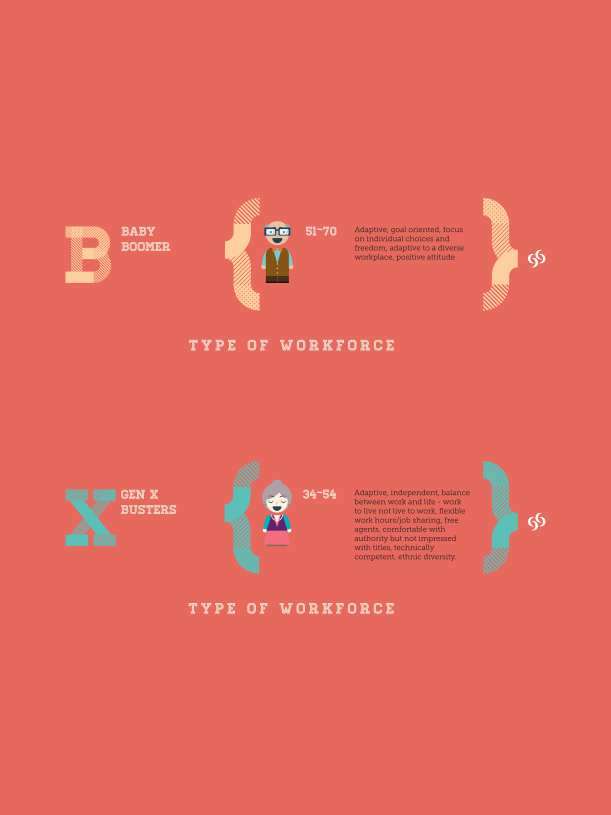
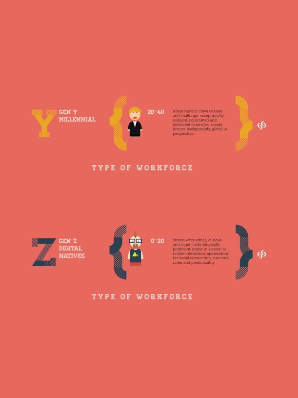
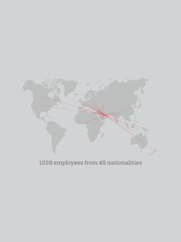
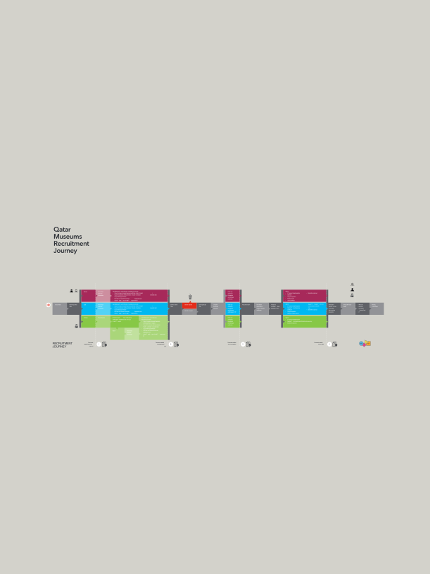
Data reimagined as designed objects, where numbers, structure, and visual language work together to communicate with the same rigour and intention as any brand system.

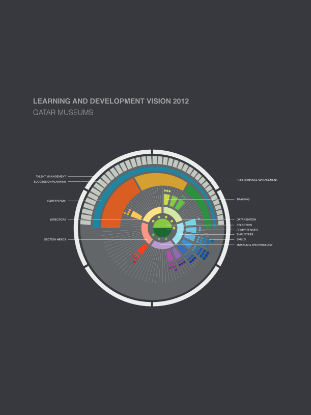
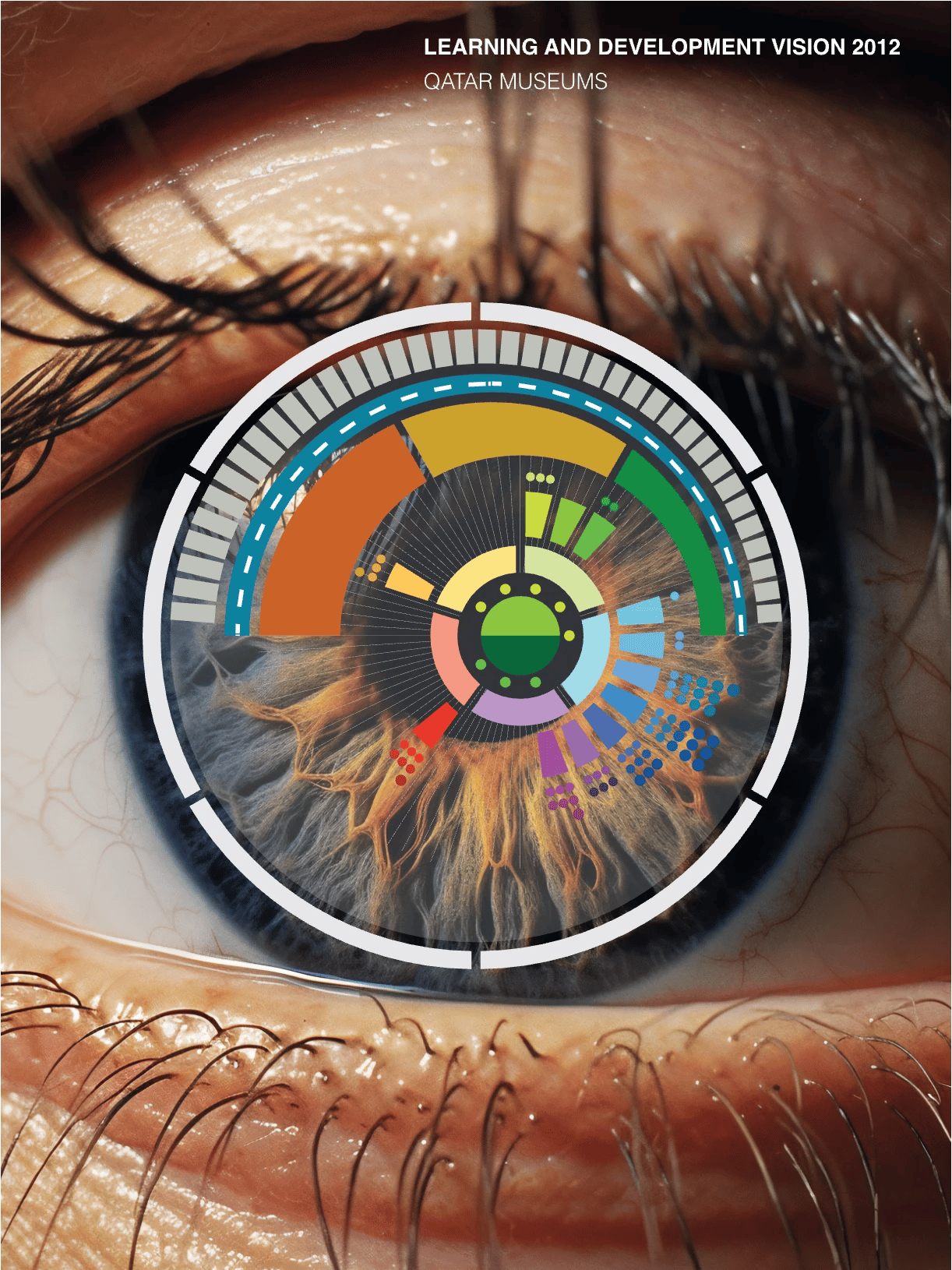
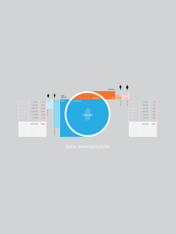
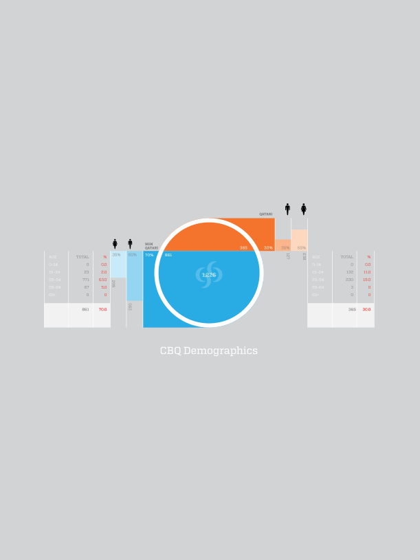
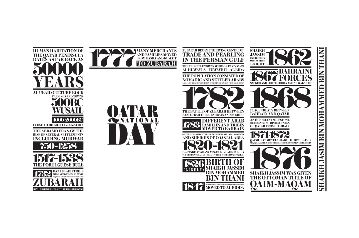
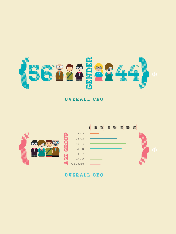
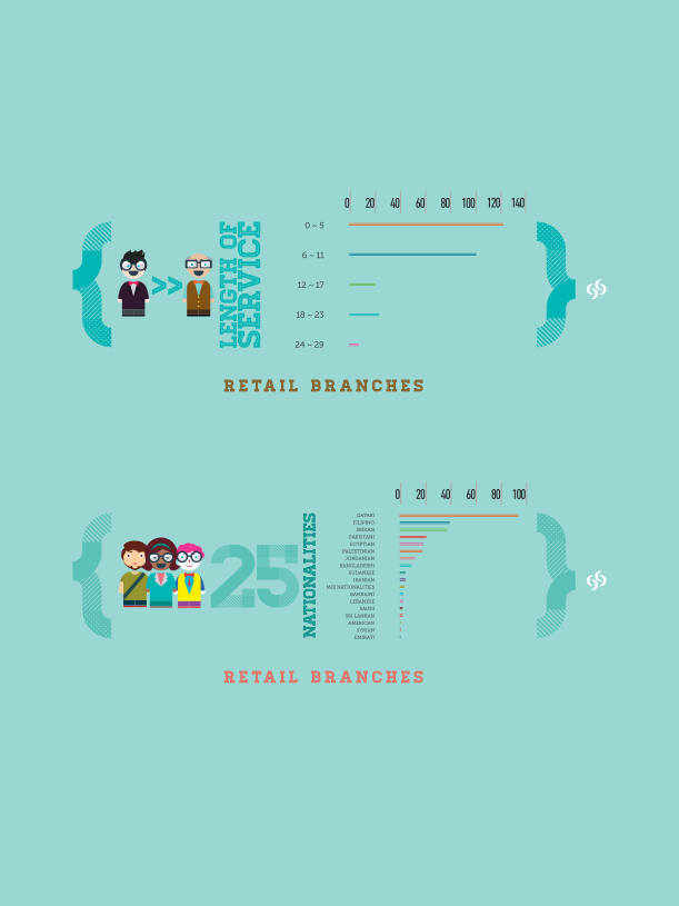
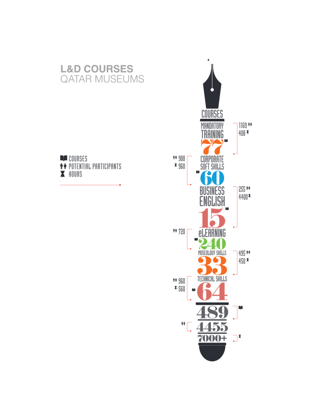
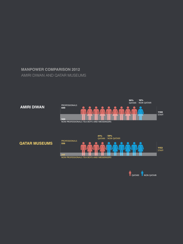
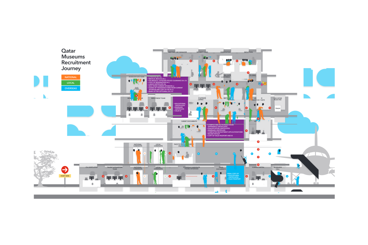
Most data visualisation defaults to the chart library. Bars, pies, and line graphs that tell you what the data says but nothing about what it means. This body of work takes a different position. Each infographic is approached as a bespoke design problem, where the visual form is built from the data itself rather than applied over it.
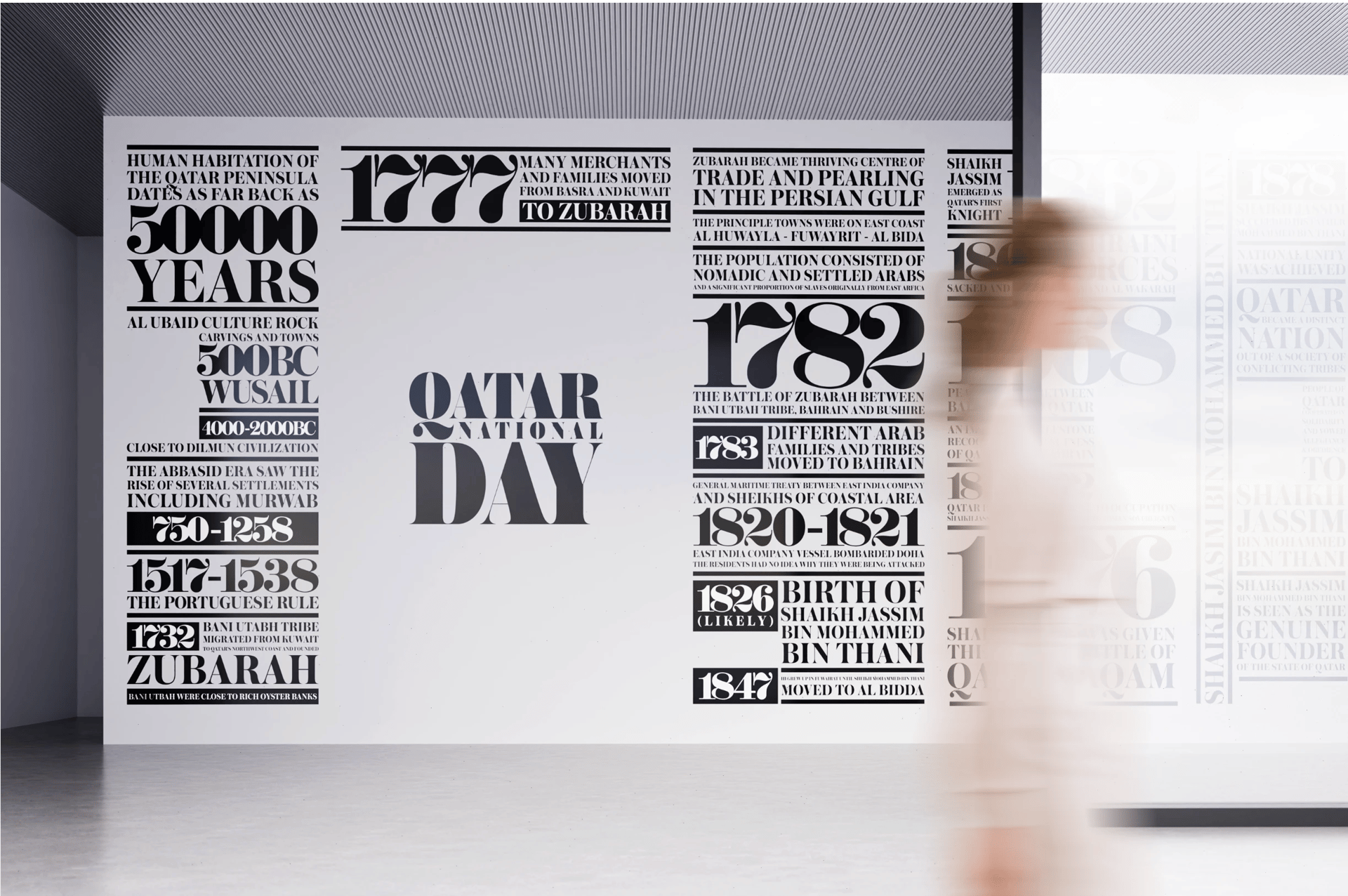
Structure, composition, typographic hierarchy, custom iconography, and spatial thinking replace generic templates. The result is information design that carries the same discipline as a brand identity or an interior, considered at every scale, from the page architecture to the individual data point.
Clients across cultural institutions, financial services, government, and the public sector have used this work to communicate complex, layered information to audiences that range from boardrooms to public exhibitions.
Design Intent
To treat data as raw material for design, not a constraint on it. Every number has a visual equivalent waiting to be found.